Your goal in communicating science should always be to make the topic you are discussing as clear and accessible to your audience as possible. Although your writing is a critical element of this, you should not underestimate the importance of producing effective tables and figures.
Some people find it easier to understand and interpret results and/or the relative magnitude of any trends by looking at figures as opposed to reading explanations in text. Similarly, tables should be used to summarize the most important, specific results in a way that makes it easy for anyone to read and interpret these. Even if you provide similar information in words, it can help to include tables and figures as well. This is particularly true when you are communicating uncertainty and because virtually all data analyses are based on probability, there will almost always be an element of uncertainty in the results you present in lab reports or research-based journal articles.
On the other hand, some people struggle to interpret figures (and information contained in tables), which means there are some guidelines you should follow when producing these, to minimize the likelihood of confusing your readers. Remember that you should be producing a table or figure to help show a pattern and/or specific information in a way that is easier to interpret than if it was simply written. With this in mind, you should always try to:
1) Be clear and concise.
- Someone without any background in your discipline (and who hasn’t even read any of the accompanying work) should be able to look at the figure or table and at least understand and interpret the pattern it shows (e.g. If you show your history-studying roommate a figure showing a pattern from biology data, they should be able to describe that to you without having read any of your report).
2) Avoid redundancy.
- There is no point writing exactly what a figure or table shows in text if you then display exactly the same information in the related figure or table. There is no need to write about every detail in text when that specific detail can be found in accompanying tables and figures (e.g. write ‘As food resources decrease, hare birth rates also decrease (see Figure 1). For each 10% reduction in food resources, hare birth rates decreased by a similar margin (see Table 1 for specific amounts)’.
3) Give clear titles and legends that are concise and easy to read.
- Try to describe the patterns shown in the figures or tables in the titles themselves, as this helps people interpret what the data show (e.g. if your figure shows the general pattern that hare birth rates decrease when food resources decrease, use a title like ‘Hare birth rates decrease when food resources decrease,’ rather than ‘The relationship between hare birth rates and food resources,’ which leaves the reader to interpret things (potentially inaccurately).
4) Be consistent.
- Make sure you use the same abbreviations throughout, and if you have different treatment groups, make sure they appear in the same order from one table/figure to the next (e.g. don’t label data of hares from Nova Scotia as ‘NS’ in Figure 1, and then as ‘Nova Scotia hares’ in Figure 2).
Deciding Whether to Use Figures or Tables
Whether you use a figure or a table in any given situation should depend on what data you have to present and on what you want your reader(s) to focus on. This often comes down to whether you want your reader(s) to focus on a pattern, or a trend, or whether you want them to focus on very specific details (such as the absolute numbers generated by experiments).
To help further, Table 1 (below, note the clear title!) should allow you to match your data to the most appropriate option for displaying that data.
Table 1: When to use tables and figures based on the different types of data you may wish to present.
| Use A Table When You Want To | Use A Figure When You Want To |
|---|---|
| Compare data values among related items or groups | Summarize trends and patterns |
| Display specific numerical values (or many data values) | Show these trends and patterns when these are more important than the specific numerical values |
| Highlight a Yes/No effect (or a Present/Absent effect) | Show explanations of procedures (methods) or responses (e.g. images) |
Some Examples (Using Table 1 To Help Decide Whether To Use Figures or Tables)
- A) You want to show the effect of a new drug that you are testing that has been designed to help people get to sleep. You have two groups of people (one given a placebo, and one given the drug), and measure the average time it takes for people in each group to get to sleep after going to bed.
Displaying these results in a figure (e.g., in a bar chart) would work best because the most important thing to display is the pattern (did people taking the drug sleep longer than those that took the placebo?) rather than the specific data values.
- B) You also want to show the ages of all the people (n=27) in the group given the drug, and whether they got to sleep faster than before they took part in the study.
Displaying these results in a table best provides the specific numerical data (ages of all 27 participants) and whether they got to sleep faster after taking the drug (Yes/No).
Specific Tips for Producing Effective Figures
1) Simplicity is important. Try to show the main pattern or trend as simply as possible.
- Hint: in many cases, bar charts or scatter plots are the best options, while pie charts are usually bad choices because research shows that people are not very good at comparing ‘slices of pie’; it can be very hard to judge between two groups/categories that are similar in terms of their pie slice, whereas the same comparison is made very easily in bar graph form.
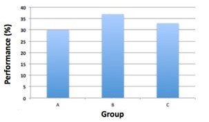
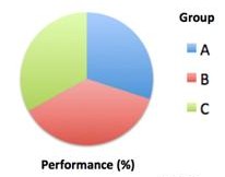
- To show the importance of this point, look at Figure 1 below and see how easy it is to tell which of the three groups (A, B and C) performed best in biology classes when these data are presented in a bar graph; conversely, see how difficult it is to judge when the same data are presented in a pie chart.


Figure 1: Bar Charts are Generally Easier to Interpret than Pie Charts.
The same data are displayed in the two charts but while it is easy to rank the three groups in terms of performance in the bar chart, it is impossible in the pie chart.
2) Label all axes and legends. In Figure 1, note how it is clear what the bars and pie slices represent (Groups A, B and C), and how the data are measured (%).
3) Include white space. The use of white space is an important aspect of design, ensuring elements are properly spaced out to maximize visual communication.
Specific Tips for Producing Effective Tables
1) Divide categories logically. Think about the order in which data should be presented so that it tells the tale you would like your audience to read.
- Hint: If treatment group number 6 did much better on an exam than the other groups, consider showing this group first in your table, and then ordering the remaining groups based on their performance rather than ordering them in sequence from 1 – 10).
- To show the importance of this point, look at Table 2 below and notice how much more effective example A is when compared to example B, which shows the same data.
Table 2: Presenting Data in Rank Order in Tables Can Help to Show the Important Patterns As Well As The Specific Values.
| Example A | Example B | ||
|---|---|---|---|
| Group | Performance (%) | Group | Performance (%) |
| 6 | 78 | 1 | 64 |
| 4 | 69 | 2 | 63 |
| 7 | 65 | 3 | 55 |
| 1 | 64 | 4 | 69 |
| 2 | 63 | 5 | 51 |
| 10 | 59 | 6 | 78 |
| 8 | 57 | 7 | 65 |
| 3 | 55 | 8 | 57 |
| 5 | 51 | 9 | 50 |
| 9 | 50 | 10 | 59 |
2) Format your table so that it is easy to read. Make sure there is sufficient space between rows and columns because it is hard to distinguish between data or see patterns in an overly cluttered table.
3) Be as concise as possible. You would often show data in a table and not a figure because it is important to show the specific data values rather than the pattern in these data. But this does not mean it is OK to include a huge amount of raw data that is not imperative for the reader to see. Try to minimize the amount of data you actually present (e.g. if you measured the height of 197 university students, you don’t need to present a table with 197 rows; instead show the mean height, the range, and the standard deviation for males and females in your sample).
Further reading:
